
Why I Like Quadrant Reporting
"One metric is a number. Two metrics are a profile"

It’s probably no surprise that I’m a fan of quadrant plots. I’ve shared my fair share of them over the last few years.
One of the main reasons I put so much faith in this particular style of visualization is the stakeholder engagement piece.
As sport scientists, one of the constant challenges we face is communicating data to coaches and practitioners who may not have a deep understanding of the testing methods or the ‘why’ behind them. Dashboards, spreadsheets, and isolated metrics can quickly become overwhelming.
Quadrant plots provide an opportunity simplify that conversation while still giving really good insights.
You can point to the chart and say:
“This is where our athletes currently sit, and this is where we want them to get to. To do that, we need to make sure we’re influencing this specific metric”
That message is almost universally understood, regardless of someone’s technical background. But beyond communication, quadrant reporting is also a powerful way to explore how physical qualities interact across a group of athletes.
Practitioners are often dealing with large volumes of data — multiple tests, multiple metrics, and entire squads of athletes to interpret. Looking at single metrics in isolation rarely tells the full story.
Quadrant reporting provides a simple way to visualize relationships between qualities and identify patterns within a population. At its core, the concept is straightforward: plot two metrics together and observe how athletes distribute across the group. Without being too reductionist, all a quadrant graph really is, is a scatter plot with reference lines at the median or mean points of each dataset. Rather than the average lines, you can also implement your own specific thresholds, should you have data on what’s required to be in the top quartile for a given metric. This is common within late stage academy set ups, to showcase if an athlete is at an acceptable level compared to first team (adult) counterparts.
Sometimes the metrics will relate to each other. Sometimes they won’t. But visualizing them together often reveals patterns that are difficult to spot when analyzing metrics individually.
In practice, here are three common ways practitioners could use quadrant reporting.
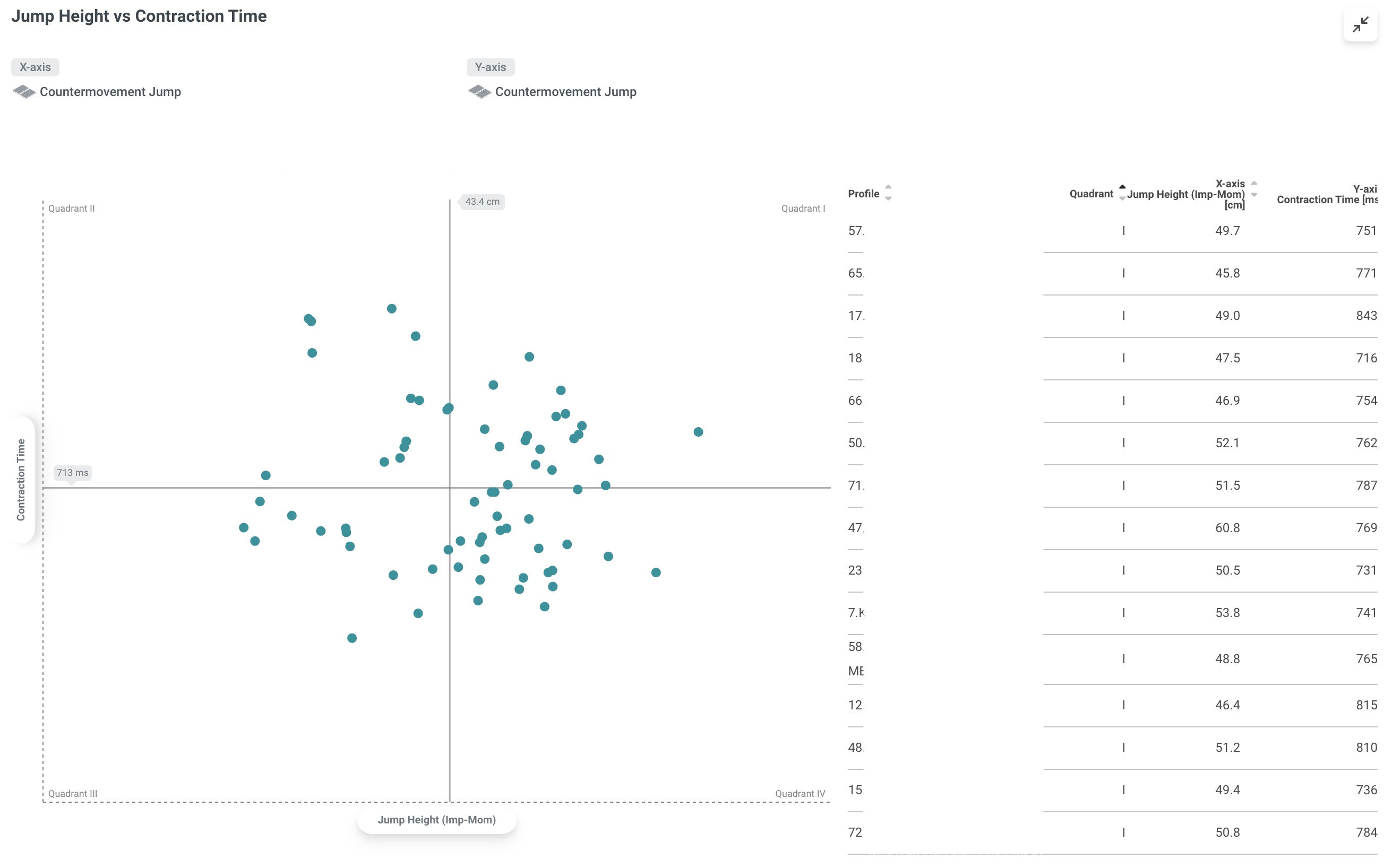
1. Comparing Metrics Within the Same Test
The first approach is to compare two metrics collected from the same test.
For example, using a Countermovement Jump on force plates, you might plot:
Jump Height
Contraction Time
Or perhaps:
Force at Zero Velocity/BM
Countermovement Depth
The objective here isn’t necessarily to prove a statistical relationship between the metrics. Instead, it’s to explore how athletes achieve performance.
Two athletes might jump the same height but arrive there through different characteristics.
One athlete might rely on rapid eccentric loading.
Another might produce force over a longer contraction time.
Plotting these variables together allows practitioners to quickly identify different performance profiles within a squad. In sports like Rugby and American Football, these different performance profiles will often be significantly different due to positional demands of the game.
2. Comparing Metrics Between Related Tests
The second approach is to compare metrics collected from different tests. This allows practitioners to explore how different physical capacities interact.
For example, you might compare:
P2 Concentric Impulse from a Countermovement Jump on ForceDecks
Ankle Plantar Flexion Strength measured using ForceFrame
Plotting these metrics together can help practitioners explore questions such as:
Do athletes with stronger ankle plantar flexors generate greater impulse in the latter stages of jumps?
Are certain athletes compensating for weaker ankle strength through other movement strategies?
These comparisons allow practitioners to examine how specific joint capacities may influence whole-body performance.
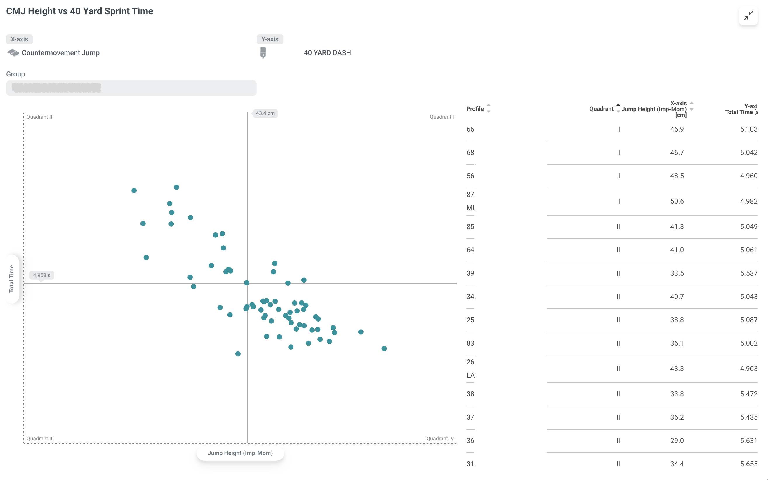
3. Comparing Outputs/Performances Between Completely Different Tests
The third approach involves combining metrics from completely different tests to understand general performance trends.
For example, practitioners might compare:
Speed data from sprint efforts measured by timing gates.
Strength or power data from force plate tests.
Plotting these qualities together allows practitioners to explore how different physical capacities interact across a group of athletes.
This has recently become easier within the VALD ecosystem.
VALD has just released quadrant reporting within VALD Hub, allowing practitioners to visualize relationships between metrics collected from different systems across the VALD suite.
Rather than being limited to comparing metrics from the same test or device, practitioners can now explore relationships between qualities such as:
Speed
Strength
Power
all within the same visualization.
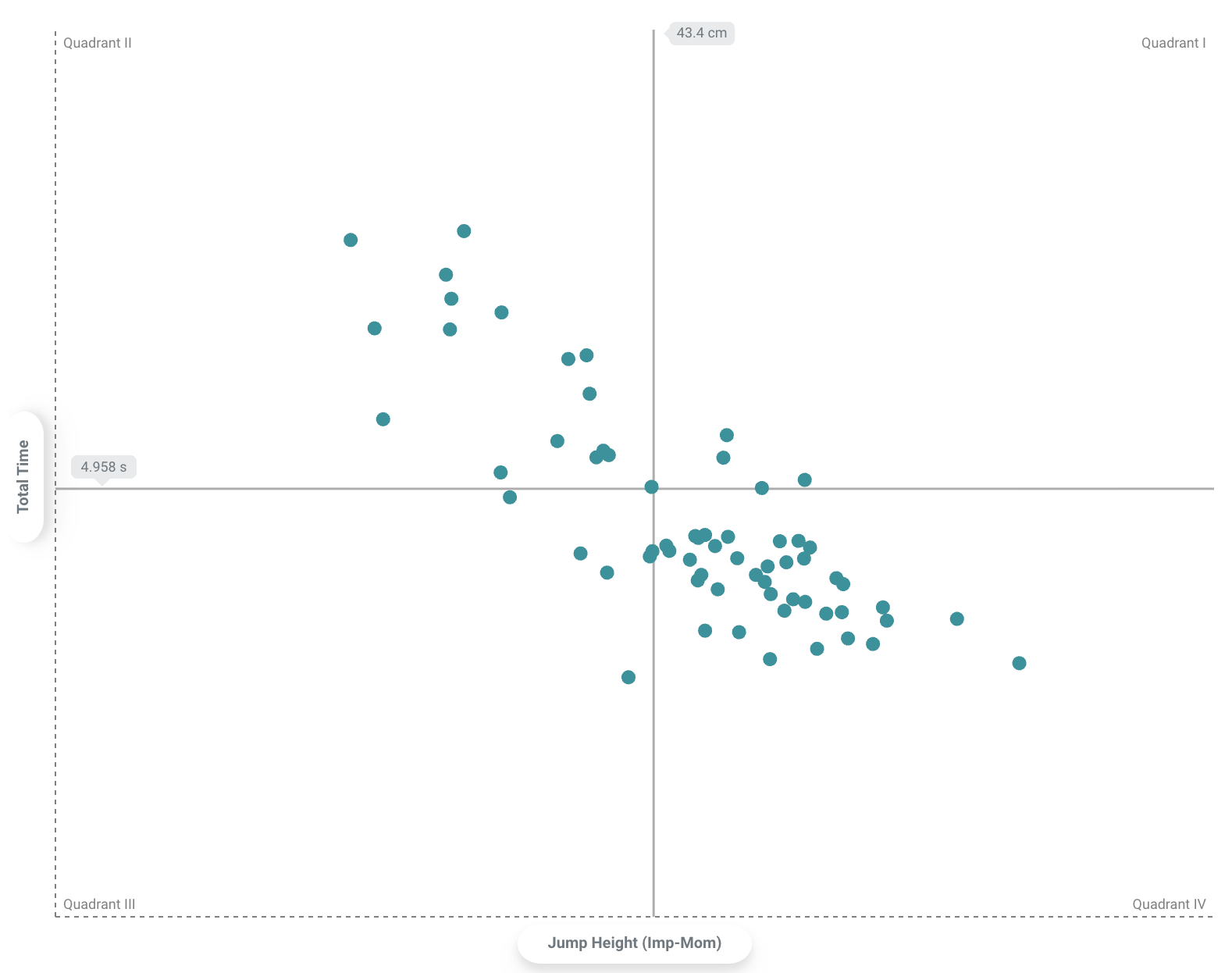
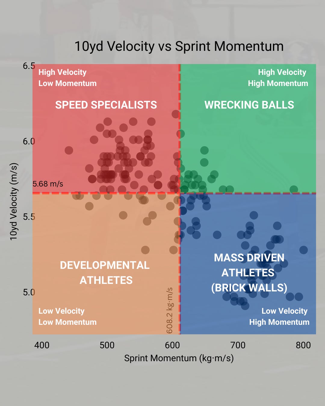
A Simple Example: Velocity vs Sprint Momentum
Below is a simple example from sprint testing.
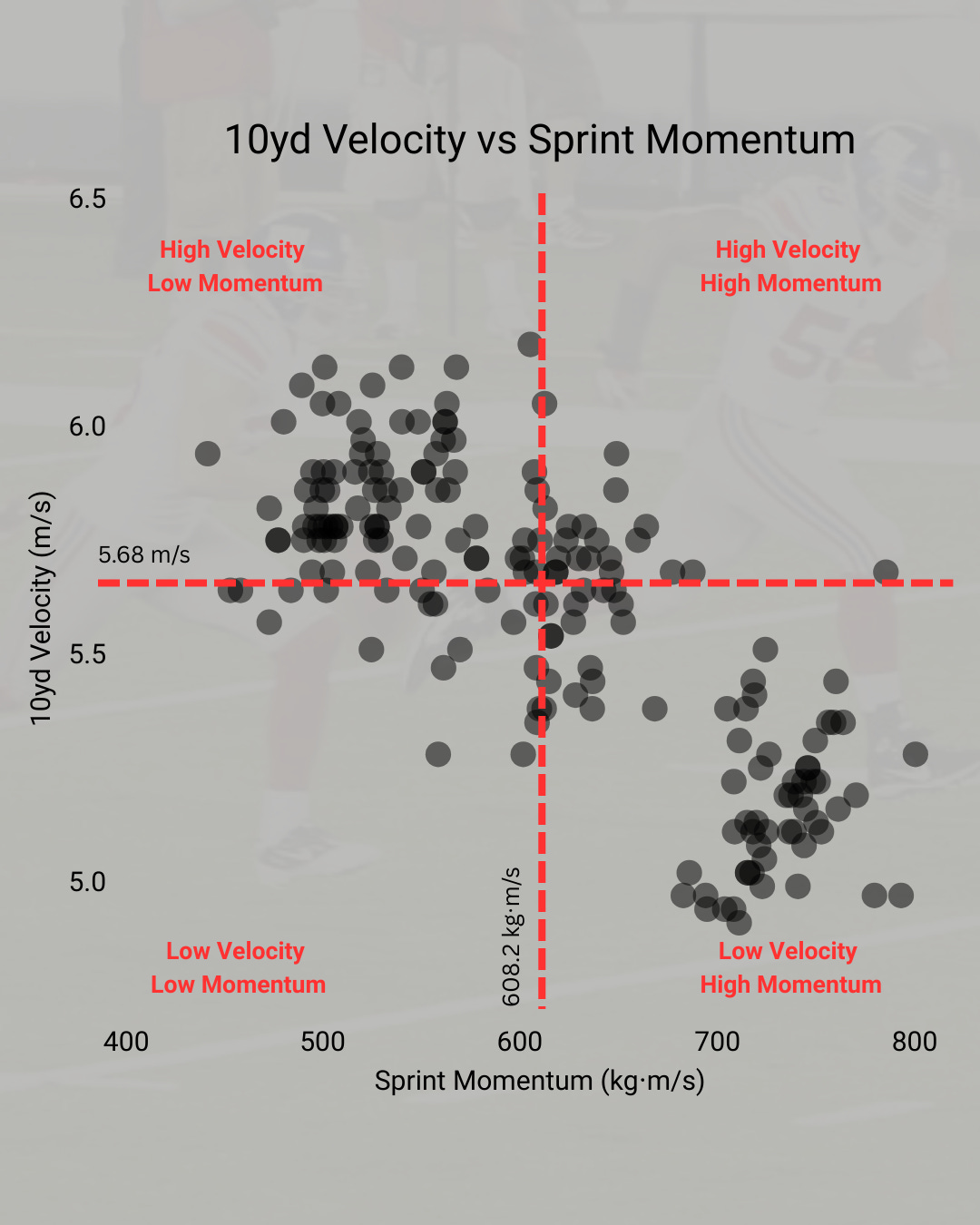
In this case we are plotting:
10-yard velocity
Sprint momentum (mass × velocity)
Typically, lighter athletes tend to run faster, while heavier athletes tend to generate greater momentum.
But plotting both metrics together reveals something more interesting: how athletes distribute across different performance profiles.
Speed Specialists
High velocity / lower momentum
These athletes can reach high speeds quickly and are often well suited to open-field roles where acceleration and agility are critical.
Developmental Athletes
Low velocity / low momentum
These athletes typically require more general physical development — whether that means improving acceleration ability, gaining size, or both.
Wrecking Balls
High velocity / high momentum
These athletes combine size and speed to produce extremely high momentum. They are relatively rare but extremely valuable in collision sports.
Mass-Driven Athletes
Lower velocity / higher momentum
These athletes may not be particularly fast, but their size allows them to generate substantial momentum, making them effective in blocking or contact situations.
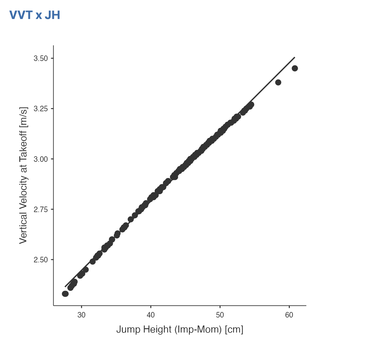
When Quadrants Can Be Misleading
While quadrant reporting can be extremely useful, it’s also possible to misuse these plots if the wrong metrics are chosen.
For example, plotting jump height against take-off velocity will typically produce a very strong correlation across a cohort.
This is because the two metrics are closely linked from a biomechanical standpoint.
While the visualization may look interesting, it rarely tells you anything new about the athletes.
In contrast, plotting two metrics that represent different qualities can reveal much more useful insights.
For example:
Jump Height (a performance outcome)
Eccentric Deceleration Impulse relative to Body Mass (insights into their strategy)
This comparison may reveal how well athletes absorb and generate force eccentrically relative to the jump performance they produce.
Some athletes may produce high jumps with relatively modest eccentric loading, while others rely heavily on eccentric impulse.
These types of comparisons begin to provide insights into how athletes produce performance, rather than simply describing the output itself.
The Key Principle
Quadrant reporting works best when the two metrics represent different physical qualities.
For example:
Velocity vs Momentum
Strength vs Speed
Eccentric loading vs Jump Height
When chosen carefully, these comparisons allow practitioners to move beyond individual numbers and begin to understand how physical qualities interact within athletes.
Because in the end, athletes aren’t single numbers.
They’re profiles.